

John Carter and the Gods of Hollywood Cover Art — An Interesting Counterargument
Just when you think you’ve got it all figured out……last night Jack Scanlan, our publicist and a good friend, gave a reaction to the use of the “giant hand threatening John Carter” on the cover artwork that stopped me in my tracks. His comment was short and to the point: “Cover art reminiscent of “white gorilla” criticism. I like ROMANCE in foreground with action-packed background like original cover art.”
The original art he was referring to (for anyone who’s not been following all the iterations) incorporated St. John’s Thuvia into the artwork. Unfortunately it’s just impossible to get that one into a landscape format and since then, I’ve become stuck on the idea that it needs to be landscape and look like a cinema screen. That took us to Abbet’s “John Carter of Mars” which features John Carter facing a huge hand ….which I liked because it looks like the hand of the gods coming down and threatening John Carter.
But Jack’s point really stopped me in my tracks. The biggest single shortcoming or failure of the marketing campaign is the obsession with the white ape/arena scene. It really does feel like a misfire to use an image so similar here.
The image I’m now trying out is the one you see below — another Abbet. It’s kind of “soft” in that there is no action in it …. but I like the atmosphere, the beauty and grace and sense of chivalry (which is talked about in the book), and John Carter wearing sword, harness, and pistol at least hints at action. The two moons are there, and the flyer makes it feel more sci-fi, or — the unique blend of sci-fi and chivalry that was Barsoom. It is in such contrast to what Disney did with their promotion — I think that’s another point. I also like the “Mars” colors and the way this one pops against the dark background…..
By the way, I also thought about using Abbet’s “A Princess of Mars” but I can’t get it into a landscape format — the composition is too “portrait”.
I’m going to have to pull the trigger on this today, at least for the first printing. Would love to hear pros and cons of the one below versus this one.

27 comments
Have to say that I like ‘the Hand’ the best. To me, it kind of signifies the “Gods of Hollywood” reaching out and grabbing John Carter; snatching him away from us, just like Disney did.
The Hand works best, IMHO, appropriate for all the reasons stated below. The other image choices may be more beloved artwork, but they are less resonant with the title and what your book seems to be about.
Or for our friend MCR, John Carter threatened by Andrew Stanton’s giant inflated ego. LOL
I vote hand also. It has the it has the feel of John Carter threatened and endangered by a large powerful force, oh you know, like Disney! It actually captures the thrust of the whole book and title with one image.
Although the Princess stepping off the flyer is hot hot hot, it is not the story you are telling.
The mother of modern sci-fi and her box office battle? Ok…I’ll put down the wine bottle.
No – for what it’s worth, I like the hand better. I don’t agree it has a “white apes” feel to it. The new one looks unbalanced to me. FWIW, the Schoonover cover I like too, after to the “hand” one.
You are putting some excellent thought into this, and I agree a lot with Abraham’s comments. Great change on the subtitle, too.
I did like the giant hand concept, but I understand the problem with that. The Schoonover art works nicely, but I find myself gravitating to the Abbet piece with the girl exiting the flyer. The romance is there, and as a huge fan of the books, this image of JC is how I pretty much pictured him in my mind. That’s from a personal level. As a writer and publisher myself, I also think carefully about the marketing. The cover does have to grab the viewer quickly. I think that all of your cover elements combine to do that. But does the main image really say “John Carter?” The cropped Schoonover, though excellent, does not “say” enough. As you mentioned in your main post, the Abbet piece with the girl exiting the flyer really incorporates a lot of “book stuff” into it. you gave good reasoning. The cropped Schoonever could almost be about anything. Does that make sense? In the end, you are going to have to go with your gut. I appreciate you asking for input. Hope it all helps. –Dan
The hand ties in perfectly with the title…stick to your guns!
Suggestion: “How a century old sci-fi classic became a flop at the box office and a fight for the fans!”
I like the “new” Abbet quite a bit – my vote is to go with that one. And I like Abraham Sherman’s suggestion “…yet continues…” better than “… but continues…”.
JMHO
Wow where’s our artistic friend Khanada? She came up with the title, maybe she can help choose the art! Not easy!
So much great art to choose from, it just depends on the concept you choose to emphasize. The hand does evoke the problem/dynamic. Don’t freak out at another suggestion, but for the title – John Carter and the Gods of Failure? Hollywood is definitely appropriate. I’ve been reading your original title here for so long it’s becoming comfortable.
Everything you’ve got to choose from so far is great – I like it.
If not the Schoonover, the hand is the second-best in my opinion.
I like this cover. It’s a good blend of old-fashioned art for a splendid story with the latest technology. The image itself brings many questions to mind: Who are these people? What is their relationship? When does the story take place? Where are they?Why are they needing to defend themselves? It looks like a portrait one would find in an historical victorian home.
Cliché? Mmh, maybe. With this project, you are making an attempt to unravel —succeeding in unraveling all the tangled threads that led to the less than stellar performance of the movie.
The title alone grabs attention. Just my opinion.
Jeff votes fit either Abbot cover.
The Schoonover piece does look better zoomed in and kept in a wider frame. I like that it is dynamic and character-focused, which to me combines the strengths of the other suggested pieces. The “dated” feeling might be largely due to that kilt/skirt of his that’s visible in the full piece of artwork.
The giant hand is another good one, as it works on a metaphorical level, though it does have a bit of a kid’s story “Jack and the Beanstock” quality like you mentioned.
It’s tough to beat the Barsoomian flavor of the St.John piece.
The one of the lady stepping off the flier is elegant and chivalrous, but doesn’t convey the sense of conflict inherent to the book’s contents.
A bit more about the subtitle:
CURRENT: How the 1912 story that was the wellspring of modern science fiction became a movie that flopped but continues to inspire fans and filmmakers
Maybe – “How the 1912 story that gave rise to modern science fiction became a 2012 flop at the box office yet continues to inspire fans and filmmakers”
Hope some or all of that is helpful…
Stick with the hand!
The Schoonover artwork could be reduced in size to make it look almost like John Carter is standing half way up the stairs.
CURRENT: How the 1912 story that was the wellspring of modern science fiction flopped at the box office but (yet?) continues to inspire fans and filmmakers
Alternative #1: How the 1912 story that gave rise to modern science fiction…
Alternative #2: How the 1912 story that inspired modern science fiction… continues to enthuse fans and filmmakers
Grist for the mill?
Abraham, one thing I’ve learned is that when someone suggests something, even if you think it’s not going to work — if it’s easy to try, try it. So I tried it and I agree, it’s interesting. I’m not sure how I feel about it. Here it is for consideration.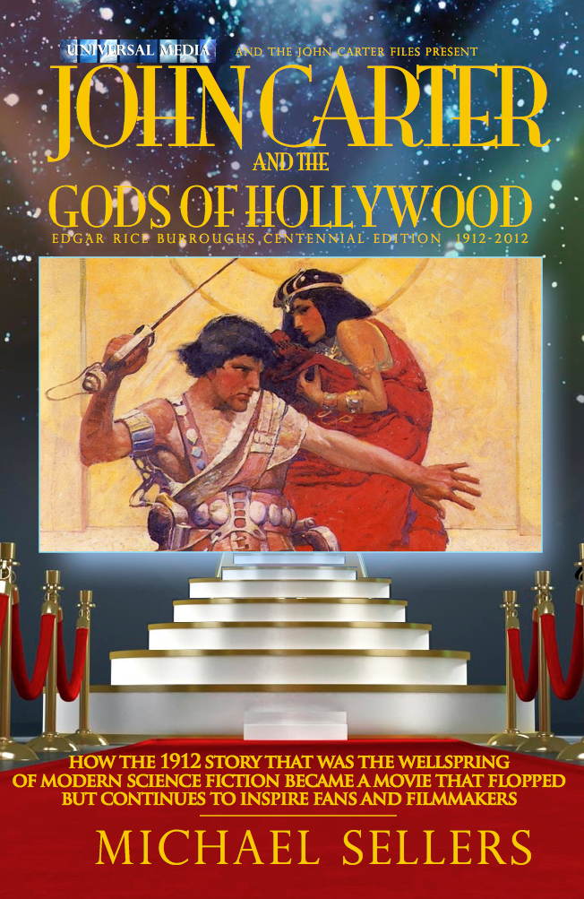
Keep in mind Jeselle’s comment — as a 29 year old, she admits that she just doesn’t like the Schoonover art and wouldn’t read it based on that. I think there are a lot of people who find the Schoonover stuff just too dated looking. I have to confess that I do too. But that said, when you crop this and get in close like it is here, it looks better.
Decisions, decisions……
MCR – good catch re the subtitle. I’ve revised it to make clear that it’s the movie that flopped, not the 1912 novel: “How the 1912 story that was the wellspring
of modern science fiction became a movie that flopped but continues to inspire fans and filmmakers”
Allow me to throw in another monkey wrench. The images suggested so far are very good, each with pros and cons, but I have to say that the original Schoonover cover for the release of the novel in 1917 has a wonderful, exotic chivalry to it. It was the perfect intro for the Heritage trailer, and could make a fine piece of artwork for this book’s cover. It has the immediate classic appeal to emphasize the history of the project, and is a dynamic pose with romance to it, giving a sense that John Carter is ready to fight off a threat. I know it’s more portrait-shaped, but the content is great. Just my two cents, though these others you’re considering are great as well.
Here’s a link to a clean copy of the Schoonover artwork:
http://www.erbzine.com/mag4/pm01.jpg
I liked the hand grabbing for him-it symbolized how Hollywood and the filmmakers thought John Carter of Mars was nothing more than a mere toy to be played with and then stop playing with it when they broke it. That said this one is OK.
The only quibble I have-and it may be too late to do anything about-is the subtitle. It reads that it was the 1912 novel that flopped, not the movie. It could just be me but that’s the impression I get from it.
I like the giant hand better. This one is so classy, and the story of John Carter the movie is anything blut classy! Taking an illustration that reminds of the giant ape is awesome, in my opinion.
Do it – its gorgeous romantic and ‘old hollywood’.Not that the other seemed wrong …
Ergh… the hardest part of baking a cake for me is putting on the icing… Perhaps you are over-thinking it, and isn’t that in part what got Disney into a lot of their problems?
Are you going to take off “of Hollywood”? ;p
I like the hand, it suggests confrontation, obstacles… a menacing event that John would have to do battle with. I think that’s why you’ve gone to all of this trouble to begin with – to explain the battle. This cover is all the things you’ve mentioned – chivalry and romance, but is the book in essence about romance, or struggle? And, would it be more of an incentive for someone to pick up the book in the store?
I certainly don not envy you your decisions, Mr. Sellers…
That’s a good point too. I guess the question is — which cover makes you more inclined to pick it up and consider it?
For me — when designing movie posters and now, book covers, I always look for a juxtaposition of imagery that creates a kind of allure. In this case, they both have it to a certain degree in the Hollywood/Red Carpet/ Stairway to the Gods aspect juxtaposed with the images from the movie.
If I know the story as well as we all do, I “get” the allusion to what’s going on with the hand of the gods.
If I don’t’ know anything, Im’ not sure how I react to that. Does the “hand of the giant” seem a little cheesy — like Jack and the Beanstalk or something?
The other one (the one on this post) doesn’t have such a clear connection to the title — but on some level it feels kind of intriguing to me. If I know just a little about the movie, what I know is there was a guy jumping white apes in it and it was all dusty/western/cowboys/aliens kinda thing. This image is (maybe) a little bit arresting because it suggests something quite different — a developed culture, a Mars with an aura of mystery…. and maybe I think — where was THAT in the movie trailers I saw?
Still I’m not sure. I don’t think either of the two are bad choices. Purely in terms of color scheme and how it pops from the background — and in doing so looks more like a cinema screen mounted at the top of the stairs –I think I’m liking this one …..
I never caught the conection, but seeing Hollywood was the one obsessed with the APE, isn’t it approprate for your book?
Anyway the cover above is very pleasing to the eye.
But wait, wait. If the emphasis on the white ape scene is considered a Hollywood “mistake” and part of what sunk the movie, wouldn’t that make it’s allusion here even MORE apropos?